
Death by PowerPoint. This phrase, coined by Angela Garber in Small Business Computing, has been in circulation for 15 years. So you’d think that mind-numbing slide presentations would be obsolete by now. Unfortunately, the onslaught continues wherever the presentation software is used—in boardrooms, classrooms, training facilities, community centers, and places of worship—and audiences are still struggling to keep their eyes open and their yawns stifled slide after slide after slide after slide. It’s time to admit we still have a problem.
What is Death by PowerPoint, really?
Now that PowerPoint’s been around for nearly 30 years, most of us can recite the litany of bad slide design habits that become the weapons of “Death by PowerPoint”: too much copy, visual clutter, unreadable fonts (size and/or color), bad color contrasts, overdone animations or sound effects, and reuse of the same old clip art. Sure, few of us were schooled in how to use PowerPoint, let alone the basics of visual design, and we’ve all been making it up as we go these past three decades. But it shows.
Fixing these deadly design defects is relatively easy (see Step 5)—but learning how to design good-looking slides is only part of the solution. To really avoid “Death by PowerPoint” (or by Keynote or by Prezi, for that matter) we need to get to the root causes of our use and abuse of presentation software.
PowerPoint doesn’t kill presentations. People kill presentations.
Here are five key steps—and a little tough love—for breaking bad habits and keeping your audiences alive and kicking.
Step 1: Before working on your slides, decide what you want to say.
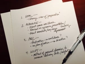 One of the most important steps is, for some, the hardest. Presenters often start their preparation by asking themselves “Which slides should I show?” The better question is “Why am I presenting?” Before you turn to PowerPoint, spend time planning your presentation’s goals, key messages, overall structure. You’ll be much less likely to see your audience’s eyes glaze over due to too many visuals. You’ll be more intentional in choosing and creating slides. And you’ll be more likely to deliver a presentation that is supported by slides—not the other way around. As a client said to me recently after forcing herself to put aside her slides and focus on content: “Whoa. This is changing everything…”
Step 2: Practice without your slides.
It sounds counterintuitive. But working without slides can make you better at using them. After all, you’re the presentation, not your slides. So early in your practice, talk through your presentation without PowerPoint. This will accomplish a number of things: 1) you’ll start internalizing the organization of your presentation, ultimately making you more confident, grounded, and less reliant on what’s on the screen; 2) you’ll be encouraged to imagine the audience in front of you (where your focus should be), rather than the slides behind you; and most importantly, 3) you’re likely to find you don’t need as many slides as you had planned. So cut them.
Step 3: Know your transitions.
When you’ve finished talking through the content of a slide, what will you say to get to the next? (Hint: it shouldn’t be, “Next.”) Knowing your transitions from one slide to another will not only keep you focused but will also help your audience make sense of the whole presentation and understand the relationship of its parts. You’ll avoid the death knell created by a seemingly endless succession of disconnected slides, one after another after another.
Step 4: Give your audience a “tour” of each slide.
Remember: every time you throw a slide onto the screen, that’s where your audience’s attention will go. They say to themselves, “What have we here?” as their eyes read the title or scan bullet points or interpret an image or chart. If you’re talking while they’re going through that interpretation process—however brief it may be—they’re probably not listening to you. So, instead of competing for the audience’s attention, start each slide with an orientation. Announce the slide clearly, and tell the audience why it’s there and what’s important about it.
Step 5: Refuse to be a slacker.
I’ll be blunt: most presentation software abuse is due to laziness. Bad habits—like the design don’ts mentioned above—are spread because people don’t take the time to break them. Don’t let this be you. Just because everyone in your industry puts tons of copy on their slides or averages 50 slides per hour doesn’t mean you need to. If you don’t know how to “hide” slides, build bullets, or change the speed of transitions, learn. Wondering what colors or fonts are best to use? Google it. Using any technology requires time and the acquisition of new skills, so commit to becoming proficient.
Let’s do it, folks. Let’s commit to giving killer presentations (in a good way) and ending “Death by PowerPoint” in our lifetime. Who’s with me?